Moolah U
Helping parents teach financial literacy to their children
Overview
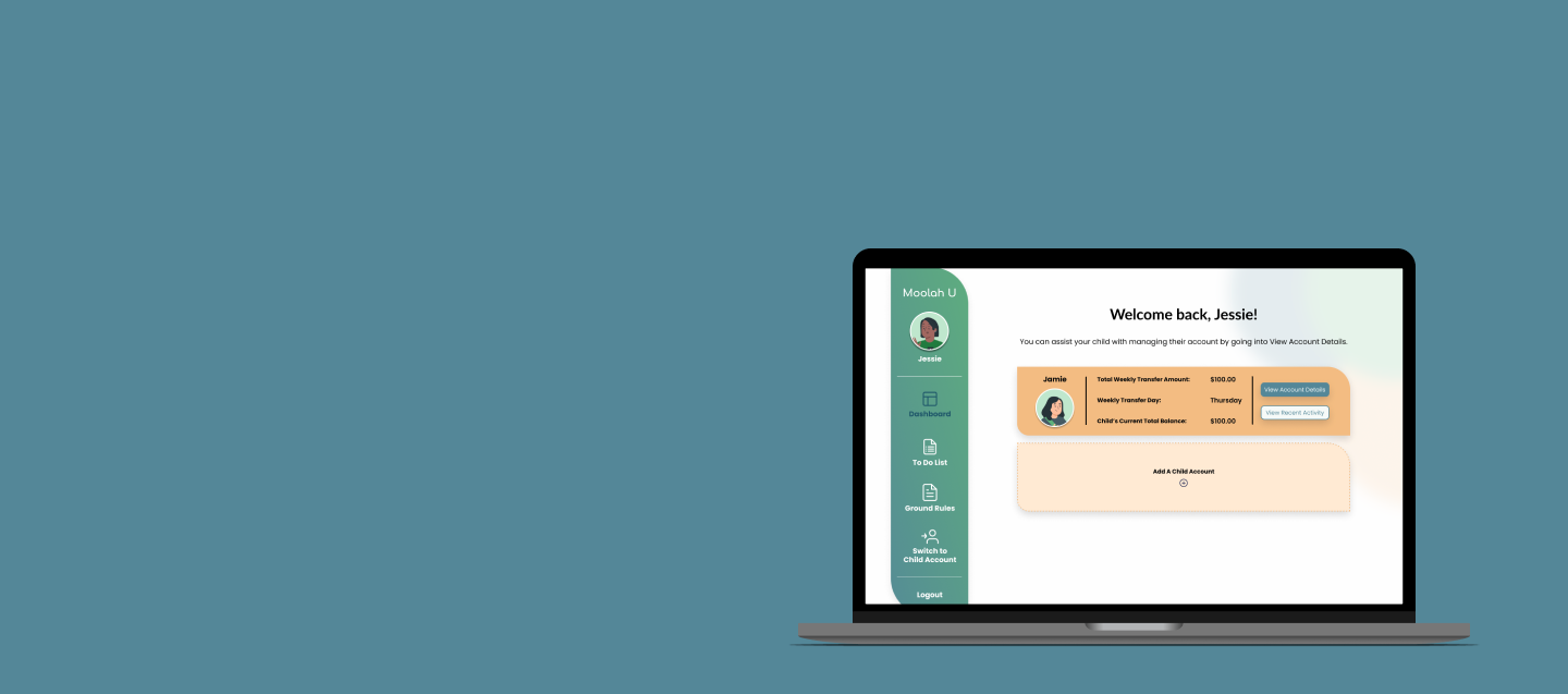
A glimpse at our redesign and reimagination of Moolah U's current beta of their web application. The redesign takes what Moolah U has now and gives it a user-centric update in both the experience and design aesthetic. The reimagination takes a fresh look and approach to the overall design of Moolah U's application.
My Role
UX Researcher
UI Designer
The Team
A group of UX
Design Immersive
Fellows
Duration
5 weeks
Tools
Figma
Google Docs
Goodnotes
Maze.co
Discover
We started this project with our stakeholder interview, during which we wanted to hear the story of her company and the application. From her interview, we felt her Stakeholder Problem was:
Parents do not understand the purpose behind the functionality of Moolah U.
With Moolah U's existing application, the best approach to redesigning its website was to follow an Interactive Design Process.
We conducted Remote Qualitative Moderated Usability Testing with 6 parents and their child. This form of Usability Testing served 3 main purposes:
User Interviews Results
During the User Interviews, there were two main pain points:
100%
of parents clicked through onboarding screens in under 7 seconds
66.7%
of parents admitted to not reading these screens at all
50%
of parents tried to view these screens at a later point but could not figure out how
“It was a lot of information before even signing up”
-Parent 2, Pain Point
Issue with Bucket functionality:
Parents expressed that they didn't understand the purpose of the Buckets and were concerned about not being taught how to use the Buckets' functionality properly.
“I didn’t know what the buckets are for/what I was about to get into”
-Parent 3, Pain Point
Usability Testing
Allowed us to observe parents and childerens interactions with the platform
Probe why parents did not understand certain functions and purpose
Discover if this product delivers the experience parents want while being the solution they need
The parents' onboarding process didn't provide the user with adequate information.
The Bucket functionality, the framework for organizing money within the application, is not explained.
Define
After synthesizing the interviews into an Affinity Map, we agreed that the Problem Statement for our Parents was:
Parents don't have access to clear and easily digestible financial education tools to teach their children healthy money habits.
User Personas
Design
Sketches
Entering the Design phase, my team and I went into a design workshop where we sketched several sample pages in time boxed exercises. Below are my contribution.
Low Fidelity Prototype
To see how the Sketches impacted our design, please dive into our Figma Low-Fidelity wireframes below. The prototype will navigate you through the process of being a new parent creating your account.
Usability Testing Results
We conducted Unmoderated Qualitative & Quantitative Usability Testing with 10 parent participants using Maze. During the usability testing, we focused on two main Tasks: Onboarding a New Parent into the Application and Creating and Editing Buckets.
50%
of parents felt like Onboarding was successful.
92%
of parents felt like Creating and Editing Buckets was successful
You may click above to open the prototype in Figma
Deliver
Our design team devised two designs to propose to our client to create a phased approach to solving the design concerns.
Design A
Incremental UI changes, staying with a similar format but applying design changes to address major user pain points and branding inconsistencies. Below you can see the impact of the proposed changes.
Design B
A complete overhaul of the current design by reimaging UI elements, branding, and application structure to answer user and stakeholder pain points. Please take a deeper look into the design by testing the High Fidelity Prototype below.
Moolah U’s Current Beta
Design A Design
You may click above to open the prototype in Figma
Next Steps
Implement minimum design recommendations from Design A
Guide Moolah U's children's version of the application through the design process, with examining the potential of having age-focused user experiences
Create more iterations of Design B that focus on Onboarding and conduct more usability testing
What I Learned
This project allowed me the opportunity to dive deeper into the tools and practices of a UX/UI Designer. As a member of the design portion of this team, I focused my efforts on creating low and high-fidelity wireframes along with the design system. This experience showed that it is essential to start with the small pieces of the design system because they will pave the way for the critical components later. I created the building block to make our designs streamlined and consistent. Understanding the importance of planning early and using the components to streamline the design will be part of my process for the foreseeable future.


