50 States Running Club
A Community Fit For You
Overview
A redesigned 50 State Run Club website that brings together all of their clubs across the US into one platform. The website streamlines broadcasting information about their events while invoking a sense of community through reimagined social communication.
My Role
UX Researcher
UI Designer
The Team
A group of UX
Design Immersive
Fellows
Duration
3.5 weeks
Tools
Figma
Google Docs
Otter.ai
Goodnotes
Maze.co
Empathize
Competitive Analysis
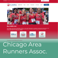
To understand the user experience with using different running club websites a Task Analysis was completed using the following websites.
We examined 3 task during the Task Analysis to understand what functionality that our competitors were providing to their users:
User Interviews
We conducted user interviews with runners on the spectrum from marathon runners to casual weekend runners to understand their relationship with running and their involvement in their running community. From the interviews, we gathered 3 key insights.
I want a way to be able to personalize my running experience and the community I am in.
I want to run consistently on a weekly basis to keep up my form and shape.
I need an efficient and effective method of my preference for staying up to date about events, runs, and marathons happening in my area.
After synthesizing the key insights of our users interviews through Affinity Mapping their responses, we developed the following Problem and Solution Statements.
Problem Statement
Runners need a way to feel part of a greater community, so that they can expand upon their running network, while collectively running for leisure and training for marathons.
Solution Statement
To design a website for 50 State Running Club that will bring community engagement and event planning to their entire community under one platform.
User Personas
Ideate
Leaving the Empathize phase, we knew that we wanted our design principles to implement three core functionalities:
Events
Implement event page to allow for runner to find and attend local events
Communication
Implement a direct message for runners to private message each other
Community
Social feed for runners to share their experiences and interact with other runners in the area
Sketches
Entering the Ideation phase, my team and I went into a design workshop where we sketched several sample pages in time-boxed exercises.
Prototype
Low Fidelity Prototype
Creating the LoFi wireframes is one area I took a lead in developing during this project. During this phase I created multiple screens to work through both user personas.
Initial Usability Testing
The purpose of the usability test is to understand how a user would navigate the 50 Running Club mobile website. The scope of the testing is to measure the ease of navigating and communicating through the website.
Iterations
Our testers gave us great insight into their perspective using the wireframes. We gathered our observations and proposed solutions for improvments.
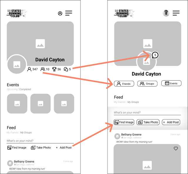
Improvement 1: To have an easier way to identify where to find their user profile.
OBSERVATIONS
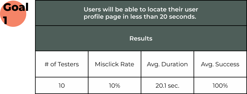
While it was one of the shortest tasks, it took the longest to complete. This task also has our second highest misclick rate. After reviewing the Click and Heat map, we noticed that the users were clicking on three concentrated places: the Getting Started button, the profile image, and one of the events.
SOLUTION
From reviewing other social media platforms, we noticed that all of the user profile pages are identified by a user’s photo. To make the user profile more dominant on the page we changed the image from a user icon to an actual image from our user personas. We believe our users will identify with seeing a person as the user profile.
Improvement 2: To have clear instructions on creating posts and a predominant area for creating a post section under their user page.
OBSERVATIONS
Reviewing the testing results showed us that we missed the mark here. One of the screens in this task had a 100% misclick rate and it took our users an average of 20.5 seconds to identify how to create a post. The heat map showed us exactly where our issues were with the prototype.
SOLUTION
After taking a step back from the design we noticed that the create post section blended in with the rest of the page. In order for this section to pop out to our users, we decided to change the background color of the section so it was apparent to the user that it was different than the rest of the page.
Improvement 3: To have buttons more recognizable.
OBSERVATIONS
We didn’t have consistent buttons throughout our prototype. In some places, we had standard buttons. In other places, we had icons and in some places, we had words with icons. This problem became very prevalent when we saw the results for trying to find Events and Messages. Finding events task had 71% misclicks. While 12 of our users completely went off-path while trying to navigate to the Messages.
SOLUTION
We decided to standardize our buttons. Now all of our buttons will be in the same style. We have made variations of buttons to show for different parts of the website but they will all be standardized. This will help the user to understand which buttons are tappable and it will build consistency with our users.
Improvement 4: To locate events in their area.
OBSERVATIONS
In our comments from our usability testing, several of our users mentioned concerns about mapping without state names. While it didn’t hinder usability testing, we believe if the users are concerned about it then we should be too.
SOLUTION
We wanted to provide another method for users to search for their home state. We implemented Find My State button with a scroll wheel selection attached displaying state names. This will allow users to search for their desired state alphabetically.
Sequential Usability Testing
The purpose of the sequential usability test is to examine how our iterations from the previous usability test were perceived by our users. The scope of the testing will still be to measure the ease of navigating and communicating through the website but will have some tasks removed based on how well they tested in our preliminary test.
Design
Colors
Typography
High Fidelity Prototype
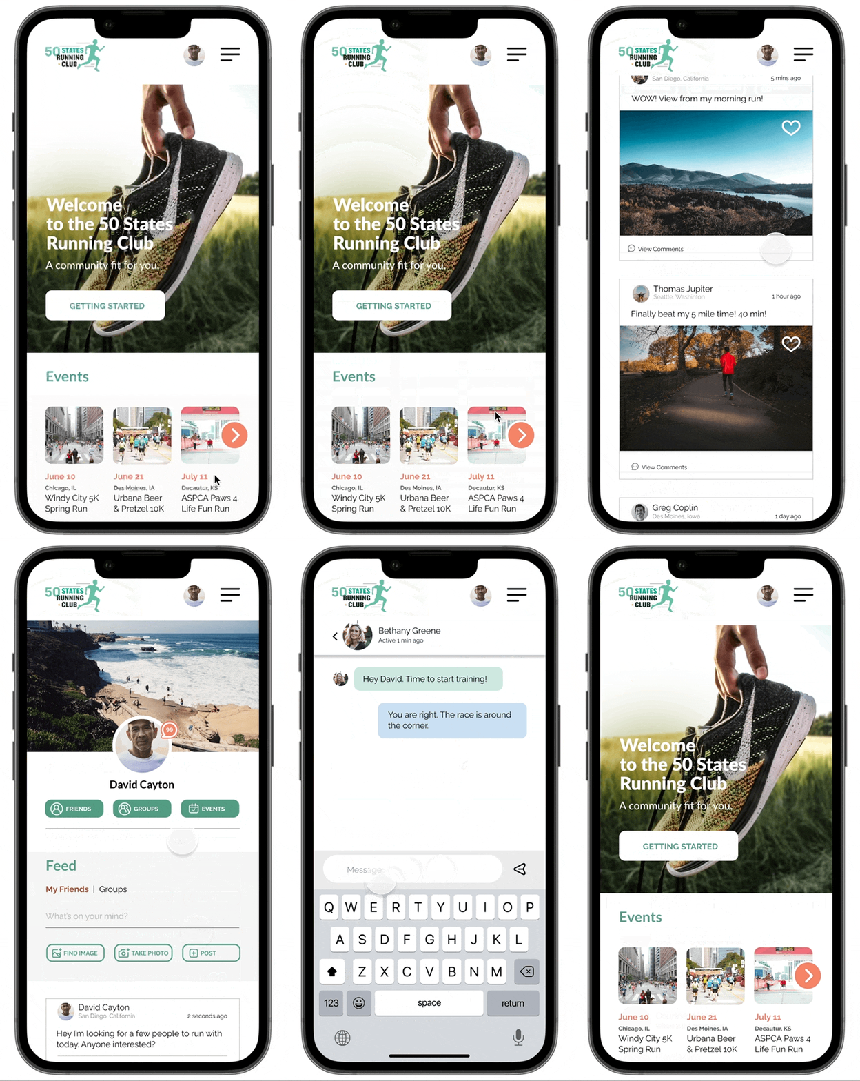
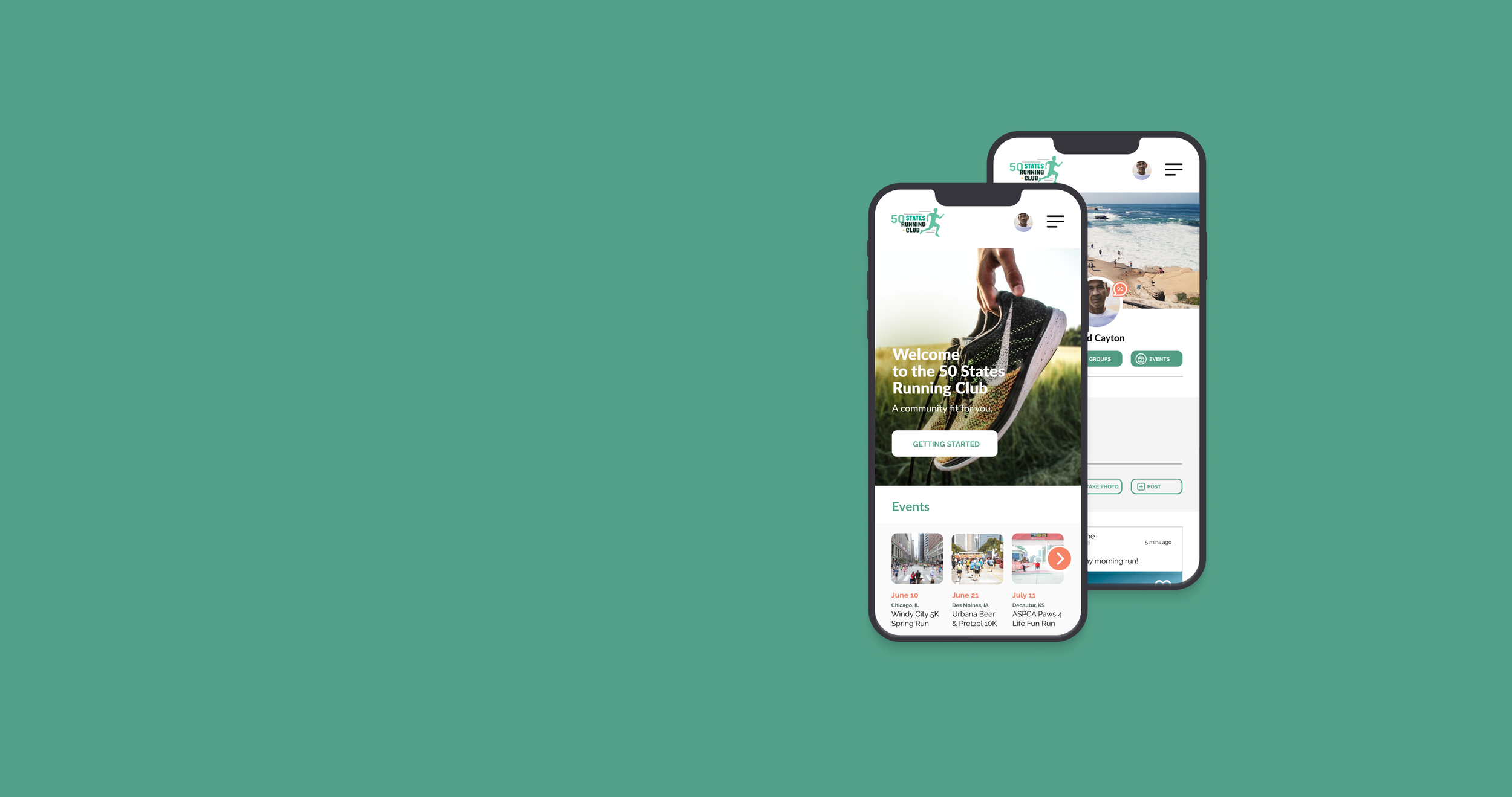
David’s Flow
This prototype shows you how we:
Designed the Home Page
Access the User’s Profile
Make a post on our News Feed
Access the User’s Messages
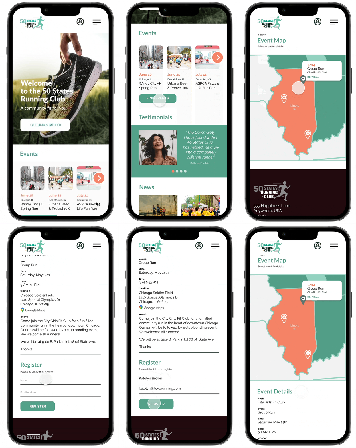
Katelyn’s Flow
This prototype shows you how we:
Found Events at the National Level and then narrowed it down to our local area
Discovered the details for an Event in our area
Registered for an Event
Next Steps
To have a more intuitive way of creating a post on their profile page.
OBSERVATIONS
Users are still unclear about how to handle our create post function on the website. While it did have a 90% success rate, it took longer than the goal of 30 seconds to complete and it also had a 45% misclick rate. There were comments from users that gave suggestions of an overlay or even moving the features location.
SOLUTION
After one of the comments, we noticed that the wording on the button in the create function was “Add Post”, which was calling for action. We didn’t create the interaction to happen in that manner. We will look at the buttons’ wording and reimagine how we can display this feature to the user.
To have a better access point for messages.
OBSERVATIONS
Messages scored very well in the sequential usability testing but some of the users still had difficulty with the task. We had a 30% bounce rate for this task and a 70% average success.
SOLUTION
Some of the users asked about placing comments on the hamburger menu. We also thought about adding a message icon to the user profile image in the navigation menu. We will have to test both theories through A/B testing.
What I Learned
During this project, I learned a few things about myself and how I function within a UX/UI team.
This project has helped me understand that I enjoy all aspects of being a UX/UI Designer. For example, I had to do all project phases during solo projects by myself. Working in a team allowed me the ability not to have to work on all steps, but I had a desire to. That desire showed that I want to be a full-stack UX/UI Designer.
Within a UX/UI team, I have learned that I can contribute to my team in all phases of the design process. I was flexible and balanced out what the team needed to succeed. My impact ranges from conducting user interviews, designing the wireframes, and writing reports and artifacts. I can fill any gap that my future UX/UI Team has.

